Wednesday, June 5, 2013

Mini Series Reflection

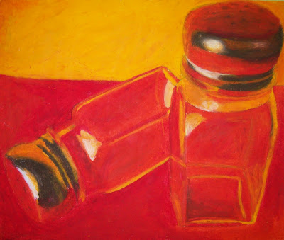
In this Mini Series I produced three works which aimed to depict transparency in some form. Subsequently, the objects chosen as subject matters were similar in material and structure, being glass salt shakers and a miniature wine glass. Two of the pieces were done in oil pastel, and one in pencil, and I think that each had its own strengths and weaknesses. My first oil pastel (left) made use of blocks of color, a vibrant palette, and unification through shading. On the other hand, in certain areas it lacked depth because of minimum layering and lack of relevant details in the glass. Using this information learned in the first pastel, I attempted another using a wine glass (middle). The strengths of this piece were its use of complimentary colors for contrast, the glossy glaze at the base, and the details of distortion within the cup. While areas are fairly realistic, some parts required darker outlines and a greater sense of symmetry. Lastly, my pencil sketch of the salt shakers (right) was successful through use of fine details, focus on values of black, and glare, but could have been improved with more graduated shading and bends in glass. Overall, each of these works provides a different insight into the notion of transparency. My personal taste leads me to be partial to the wine glass because of the animation between the orange and blue, but in terms of the depiction of transparent object, I think that the pencil sketch was most successful.


Mini Series (3)

For my third and final work in this Mini Series, I revisited the salt shakers, this time using pencil rather than pastel. One of the major benefits of working with this medium is how easily it can be controlled. I found that areas of glare and bright light were significantly easier to show using pencil, especially on areas such as the rims where white spots appear. Also, by using variation in pencil strokes and their direction, I could more easily define the outline of the objects without using dark borders. One thing that I enjoyed about this piece was that by being constructed using values of black and grey, I focused more on the actual distorted shapes, instead of elaborate color constructions which in some cases distract from the purpose of the composition: transparency. On the other hand, were I to do this over again I would try to make the shading in the foreground more graduated; as it is there are patches of dark and light, rather than soft glow. Also, I would have given the salt shakers more dimension using bends in the glass near the inversion of the side's slope. Surprisingly, I believe that this pencil sketch was a more accurate representation of transparency than the oil pastel. This piece concludes my Mini Series.

Tuesday, June 4, 2013

Mini Series (2)

For my second piece in the Mini Series, I decided to continue working with oil pastel, but this time I would use a miniature wine glass as the subject. The glass provided many interesting dynamics ranging from the two challenging elipses it formed at the given angle, to the distortion of color that occurred just above the stem. Staying in theme with my last work, I decided to use a warm, rich orange for the backdrop, but in order to create an intense contrast, chose its complimentary color of blue for the floor. This contrast occurs in various sections such as the clear line in the background, the curved distortion within the glass, and a more subtle one at the glass's base. It was also important for me to represent a variety of shades: the transition from yellow orange to orange, and from turquoise to sky blue. What I am most pleased about for this piece was the base of the glass, which I believe contains a more or less realistic orange glow with circular blue and white light around it. Also, I was satisfied with the subtlety with which the base's rim's circular shadow appears, a product of a grey overlay. The details within the glass were greatly simplified in an attempt to avoid small and irrelevant lines which would not be apparent with such an imprecise medium. On thing which I would change however, would be to portray the symmetry of the distortion a bit more accurately. In its current state, the glass as a fairly asymmetrical system of shapes and effects, as opposed to the picture. Also, I would strengthen the top rim, and have it be less faded. Otherwise, I believe that so far this image best represents transparency of the ones that I have done.

Mini Series (1)

This is the first of my three-work Mini Series about transparency, an element which I felt complimented my style in past sketches. The one immediately noticeable change which this composition contains is a warm color palette. I normally gravitate towards cool colors, as shown by the sketch of the dolphin, but this picture seemed to need a more exciting and perhaps jarring sense of color. Two salt shakers were set up on red paper with a yellow backdrop to be photographed. What I loved about the photo was that it allowed areas of color to spill into one another, such as in the container's inner volume, and the surrounding paper. The red seemed to me to be a good way of tying to tie the whole piece together through its widespread inclusion on the caps, rims, and surfaces. Another aspect of my final product which I found interesting was the white glow formed at various sections on the containers. While done in oil pastel, this piece was not nearly as challenging as I had expected it to be in terms of specificity of the transparency. This was partially due to my overall strategy: to show light as being blocks and shapes. Though one could say this is more simplistic in nature, I think it effectively gives the suggestion without being impossibly complex. On aspect that I would try to improve would be layering the orange and yellow segments such that they have dimension, rather than being add-ons on the rim and lid. This first work will aid me in my use of color foundation and layering for the next piece in the Mini Series.

Transparency 2: Colored Pencil

For my first sketch on transparency, I chose an easily recognizable object (the lightbulb). However, for my second piece I aimed for a more abstract representation which might not create immediate associations for the viewer; the photo is a closeup of the fin of a glass dolphin. In this sketch, I made the details and minor shading the main focus, which is shown in the complexity of patterns throughout the dolphin's body. The first notable aspect of this sketch was the wide range of shades of blue used. I found that this made it have much more vibrancy, and eliminated any dullness. Also, I rarely use black with oil paints or pastels because of its tendency to attract too much focus to its emptiness, but in the case of colored pencils, it settled nicely surrounded by the deep blues. Throughout this sketch I wanted fairly rounded shapes, and avoided angular line intersections to create more fluidity. The white glaze on the inside of the torse was created by using white colored pencil extensively as the first layer. An element which I personally enjoyed installing to create variation in color was the purple region on the dolphin's side, which I exaggerated from the photo. One challenging problem with colored pencils is that they must be used with heavy coloring, or a patchiness appears. I tried to avoid this to give the sketch a glossy, pristine, cool atmosphere to it. This is one of my few abstract works, and I was pleased to see that even without the surrounding context of the picture, the transparency of the object was still evident.