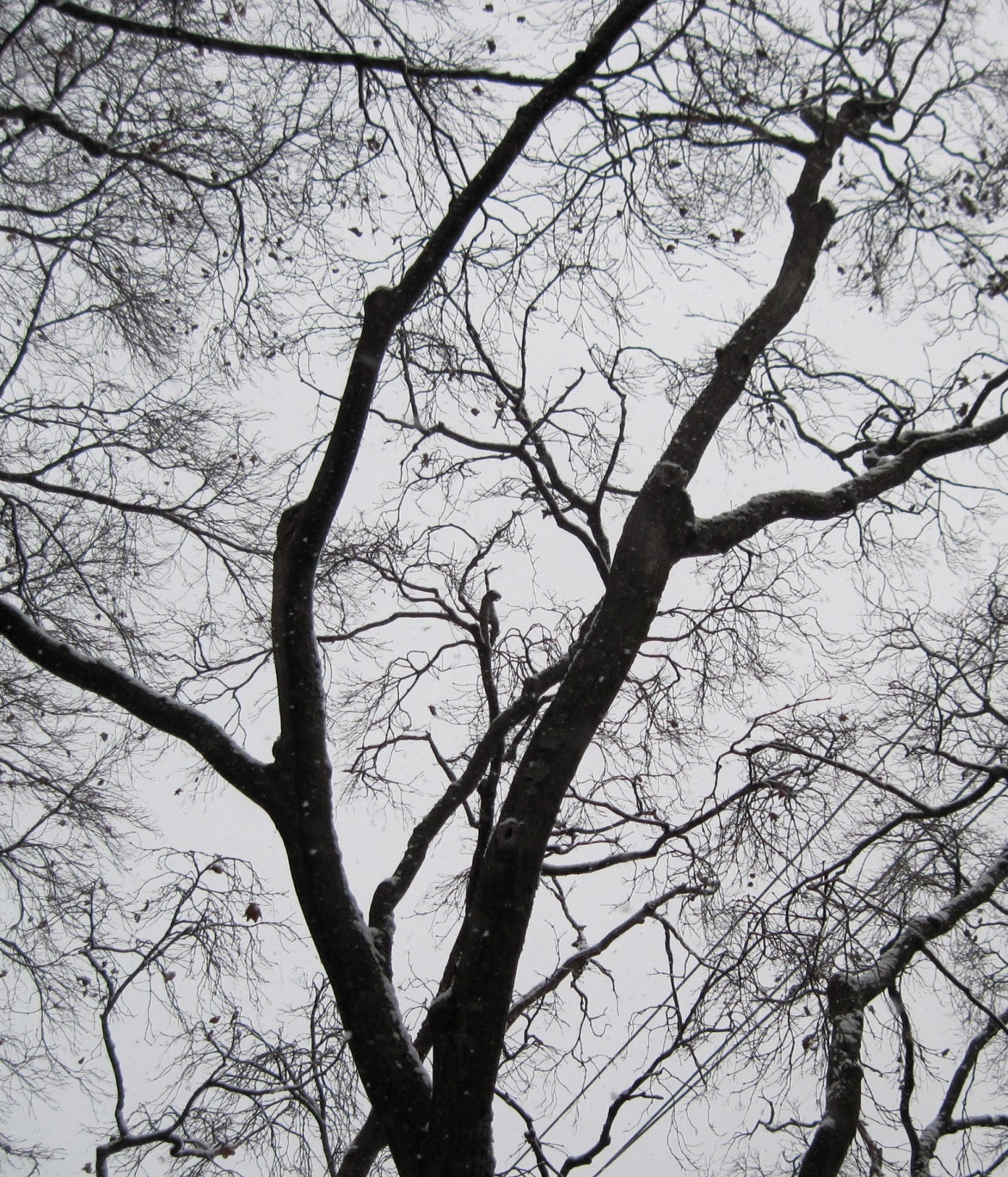
When it began to snow for the first time of the winter season, I knew that they grey sky would make for an excellent picture to paint. I walked down the sidewalk until I found a tree that had an interesting shape. I loved the silhouette that the two main branches in the picture below create, against the smokey sky, and chose it for my painting. My only fear was that the branches might be overwhelmingly complicated. Ultimately I only picked the most visible branches, simplifying the picture. Firstly, I painted the grey sky, mixing different amounts of white and black depending on the section, and variations in brush strokes which are more visibly seen in person. Something I learned from this project was the use of water with acrylics. Typically I avoid water because it tends to strip the paint, but for the level of detail required it was necessary. I chose an extremely dark brown, wanting to avoid black as usual. I tried to capture the character of the tree, including lumpy branches, and sharp angles between smaller ones. Overall I am happy with the final product, and look forward to including trees in future work, perhaps ones with foliage.
Friday, January 18, 2013
Sunday, January 6, 2013
Edward Hopper Inspired Painting
After researching Edward Hopper and finding a lighthouse painting which particularly interested me, I went around my school's campus looking for some sort of architecture of similar nature that would be interesting to paint. On the Middle School, I found a very dramatic building face which, with the dark shadows and sun's glare, had an almost menacing quality to it. However, for aesthetic appeal, I enhanced the photos colors. From the beginning the sketch, I knew I wanted exact dimensions, therefore most lines were drawn or painted with rulers and tape. My first challenge for this painting was finding an appropriate shadow color to use throughout the piece. Thinking back to Hopper's use of dark-blue/gray on the lighthouse face, I mixed various colors until I came up with one that was neutral and versatile in that it was not overbearingly dark, but not noticeably bright. Admittedly in some regions it is more purple than others, but I left it as it was because of the additional dynamic it created. Next, I painted the large face with yellow, white, and the glare. I was worried that the gold haze surrounding the edges was too complicated and unnecessary, so I just focused on the color transition. Also, I chose a more vibrant green color for the sky and different sections. The final component was adding less-noticeable lines where rectangular shapes met, which I showed using a faint blue.
Green on Green Painting
Thursday, November 8, 2012
Edward Hopper Post
Similar to my process of researching and learning about artist Richard Diebenkorn, I am currently looking at work by Edward Hopper; my next painting will be based on his work. However this will be a transition in that Diebenkorn's work typically focuses on abstract arrangements and layers, while Hopper is generally associated with realist depictions of both urban and rural scenery. When I first came across paintings by Hopper, I noticed his strong emphasis on the shapes created by various structures and shadows, primarily in architecture such as city buildings, houses, etc. This is evident in his recognizable "Nighthawks" painting, in which he portrays the perspective of looking through a window into a diner, in the evening. Of his many paintings, I particularly like the one below. I love the way he evaluates the light on different faces of cubical shapes, such as the base of the lighthouse. Contrary to my initial perception of shadows as black, Hopper uses a blue-grey. For the areas of light, he uses a yellow/beige color. Another feature that caught my eye was the cylindrical walls of the lighthouse, which have a graduated shadow. It is interesting that he choses to show that shadow as a series of three values, with the middle line functioning as the transitional color. The angular composition of shadows and lights to construct the building itself is an approach I am currently using on a painting I am doing, which is based off a photo that was taken of the face of a school building. I will make a post of this photo and painting in the coming weeks.
Tuesday, October 16, 2012
Word Sketch #3: "Sun"
For my final sketch in a series designed to illustrate the word "sun", I decided to photograph a pair of sunglasses. Originally, I had chosen two pairs and took sample photos of each, and came to the conclusion that because of the Ray Bans' reflecting yet extremely translucent lens, and the distinctive thin gold frame around the glasses, I would use it for my sketch. Some aspects I wanted to emphasize in this sketch include the tinted shading of the setting within the lenses and the darks and lights around them. In the photo I see an extremely bright foreground and dark background, and the glasses function as a bridge between the two. I am happy with the product, and how the shades of black correspond to different components. This picture contains what I would characterize as "irrelevant information" such as the the blurred sidewalk in the foreground and trees in the background; I decided that these components had little value and excluded them from the sketch. One element that was challenging to draw though was the "Ray Ban" insignia; writing letters in a half-inch space is harder than it looks! The photo and sketch are shown below:
Tuesday, September 25, 2012
Richard Diebenkorn Post
The next artist that we will be studying is Richard Diebenkorn. Of all his art, I was really fascinated by the painting below. Firstly, I love his creative distortion of the table through the glass. He creates the idea of a tall vase by blending the shapes together, such as the rim of the table, to create the object, rather them simply outlining it. I also like the blood-red table color, which accentuates all components on top of it. This contrast between radiating warmth of the red table, and the deep blue/purple is noticeable. I am looking forward to working with paint/oil pastel to create a work inspired by this artist.
Thiebaud Inspired Print
This post is a continuation of the Thiebaud inspired assignment. After I completed my sketch of fortune cookies, I traced it, and carved the image into a linoleum board. I then did a collection of 15 prints with different paints on different colored papers, and the five images to the right are my favorite prints. Interestingly enough, three that ended up being my favorites were done on black paper. I think that this can be attributed to the fact that the original design included dark shadows on the fortune cookies, so correspondingly, the black paper accurately depicted these distinct shapes. Also, the bright and in some cases neon-like paints really stood out to me. On the other hand, I think the bottom two prints also turned out well because of the complementary colors in the case of the blue paper, and the dark yellow on black. In summary, I am happy with the prints, and think that the fortune cookies are recognizable while still avoiding unnecessary outlines; shadows and white lights merge.

Subscribe to:
Posts (Atom)


