
Wednesday, April 3, 2013
Transparency: Photo

Transparency: Master Artist

 The next element which we will be exploring with is the idea transparency and how to depict it in a realistic and creative manner. In searching online for paintings which depicted this visual effect, I came across work by an artist named Janet Fish. Of all the paintings of glass, plastic, liquids, and other materials which distort light, her work stood out in particular for a few reasons, which I think are best reflected by the two paintings to the left. Firstly, Fish's painting have a great sense of depth to them which she creates through the lighting cast by transparent objects. This is done through painting dull shadows in combination with vibrant colors. For example, in examining the first painting, it is clear that the light is coming from the upper-left of the image, and it casts and enlarged and bright red shadow, emanating from the light which passes through the liquid. What is fascinating in observing her paintings is seeing how she is able to construct these complex objects such as glass and plastic in a realistic way by purposefully not using strong lines and borders. People often instinctually want to define objects with lines, but Fish views transparency as just collections of colors and distorted shapes. We are only able to understand the idea of "glass" from her painting because she rejects the idea of painting a container, but rather a large group of varied colors. Fish depicts these objects, especially the plastic, by also considering the background and how it is projected onto the object. In this painting we see the orange, white light from the sun or some artificial light, which is found below the piece of plastic. The second painting I have chosen shows many of the same elements, but on a much more intensely realist scale. Again, the idea of grooves on what to appear to be salad dressing bottles, is not represented with defined lines of boxes and circles, but instead shades of yellow and green. The way Fish can create a golden-yellow liquid in the containers with a glossy texture, but also maintain the projection of other objects onto it with reds and greens, is astounding. Both of these paintings show techniques of transparency which I hope to use in my upcoming work.
Wednesday, March 6, 2013
Contrast Portrait

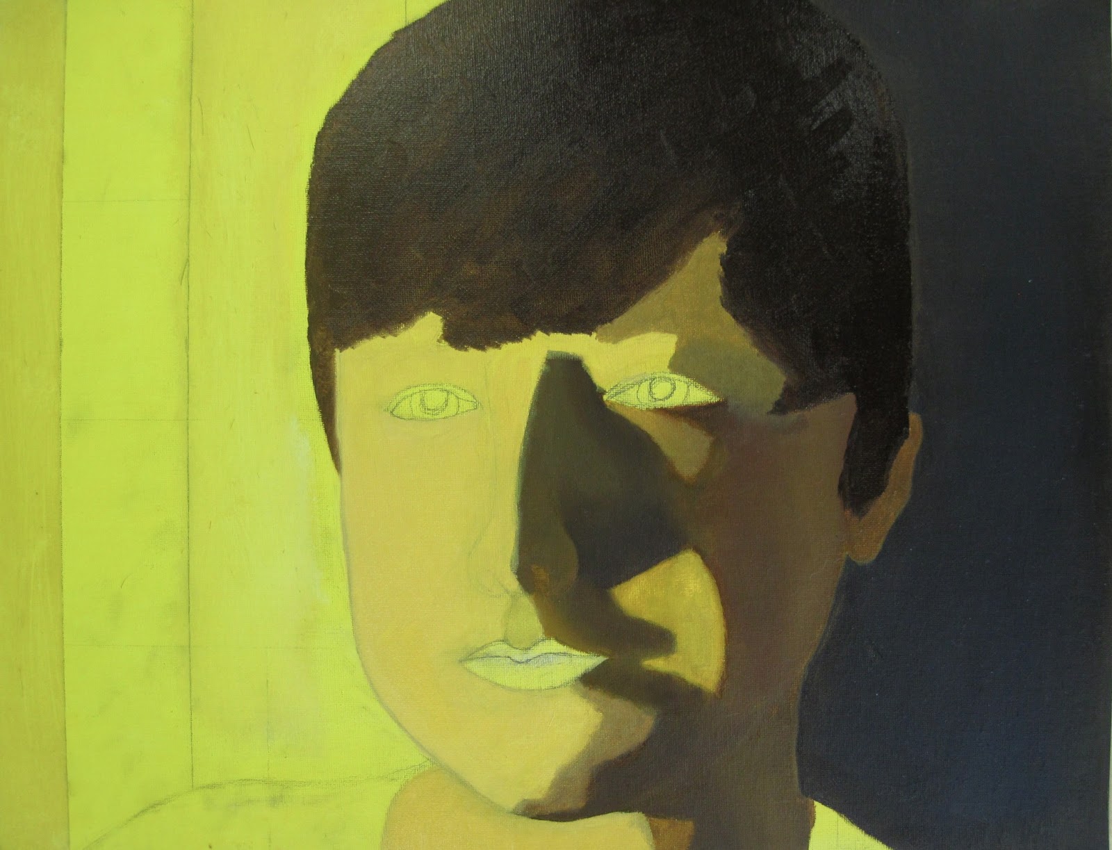
Previous to this painting, I had never attempted to capture the human face in a portrait. Nevertheless, when presented with the opportunity to paint a face, I decided to accept the challenge. Using my brother as a model, I took a series of photos using a lamp to create a clear division between light and shadow. The process of sketching this image was difficult in that, even after dividing the canvas into a grid, each groove and angle in the outline dramatically changed the appearance of the face, distorting the true expression and identity of my brother's face. I ultimately had to settle for a rough and basic facial outline, and would rely on the paint to give it depth and a sense of realism (n.b. the sketching and painting process is shown below).
Starting with a base paint of yellow, I used a light brown for the shadow on the right portion, trying to show the idea that it was just an absence of light rather that the actual color of the skin. Following this, I painted the natural skin color, a pale beige with a few dark blemishes. One aspect that was important to me was depicting the soft light transition on the chin and neck, versus the stark contrast along the nose. Lastly, I added highlights along the right smile line and below the eye, softly shading over the orange to make it appear more natural. The last components which were the most challenging were the eyes and mouth. I added various layers of red and pink paint to the lips, repeatedly scraping off the paint because it consistently has a bizarre doll-like appearance. I also struggled in showing the slight smile in the lips, which I ultimately could not depict because of how subtle it truly was. My strategy for giving the eyes and lips a more realistic look was adding white highlights, and going over the colors with a thin layer of brown to reduce the artificial quality. I am very satisfied with the glaze I tried to show in the eyes, and the representation of light and shadow. However, I think I could have improved in the proportions of the mouth and its shape, along with the curve of the cheek. Though I could not construct a completely realistic face, I think that the overall structure was accurate and I am very pleased with the light I was able to create with paint. My artistic process is shown below.
______________________________________________________________________________
Painting Stages




Friday, February 1, 2013
Master Artist Study

Friday, January 18, 2013
Winter Tree, Winter Sky Painting
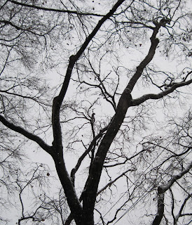
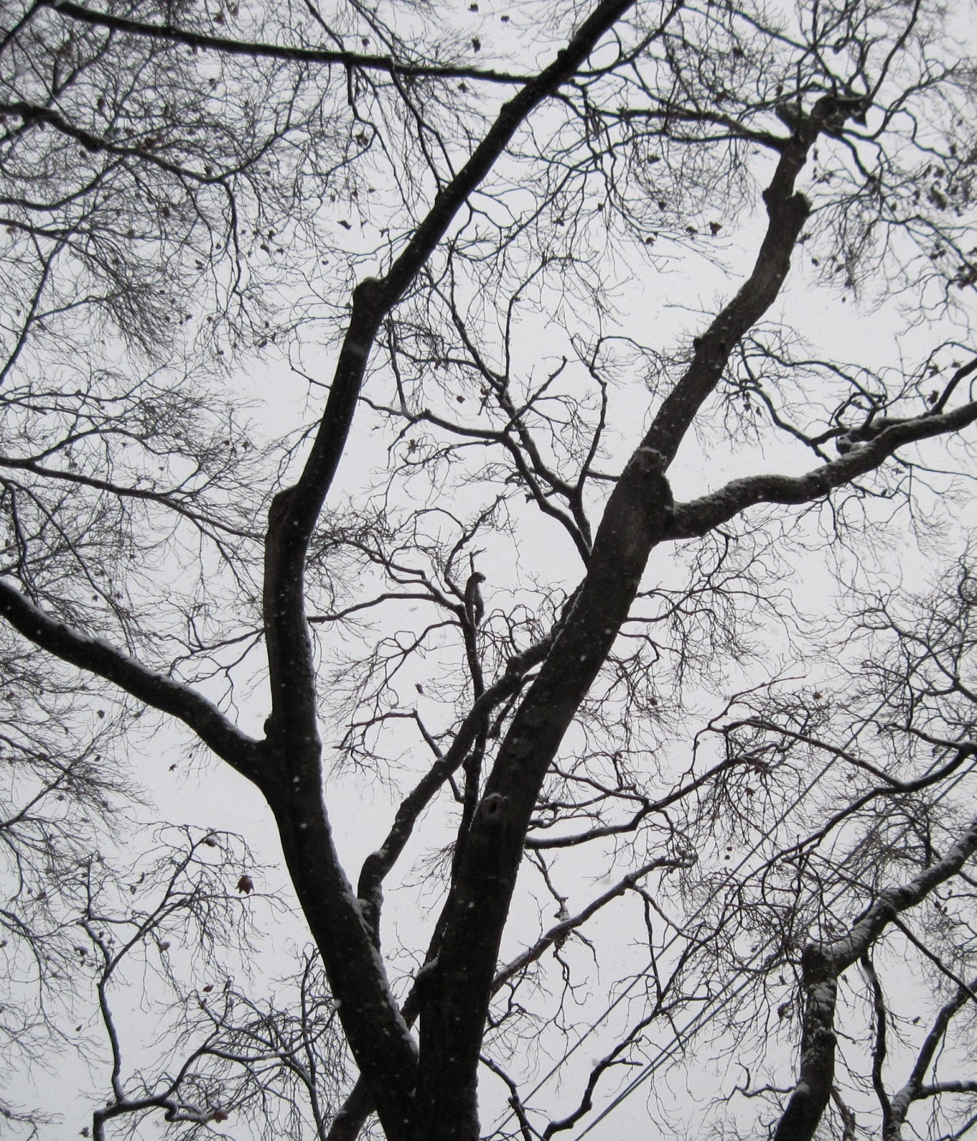
When it began to snow for the first time of the winter season, I knew that they grey sky would make for an excellent picture to paint. I walked down the sidewalk until I found a tree that had an interesting shape. I loved the silhouette that the two main branches in the picture below create, against the smokey sky, and chose it for my painting. My only fear was that the branches might be overwhelmingly complicated. Ultimately I only picked the most visible branches, simplifying the picture. Firstly, I painted the grey sky, mixing different amounts of white and black depending on the section, and variations in brush strokes which are more visibly seen in person. Something I learned from this project was the use of water with acrylics. Typically I avoid water because it tends to strip the paint, but for the level of detail required it was necessary. I chose an extremely dark brown, wanting to avoid black as usual. I tried to capture the character of the tree, including lumpy branches, and sharp angles between smaller ones. Overall I am happy with the final product, and look forward to including trees in future work, perhaps ones with foliage.


Sunday, January 6, 2013
Edward Hopper Inspired Painting
After researching Edward Hopper and finding a lighthouse painting which particularly interested me, I went around my school's campus looking for some sort of architecture of similar nature that would be interesting to paint. On the Middle School, I found a very dramatic building face which, with the dark shadows and sun's glare, had an almost menacing quality to it. However, for aesthetic appeal, I enhanced the photos colors. From the beginning the sketch, I knew I wanted exact dimensions, therefore most lines were drawn or painted with rulers and tape. My first challenge for this painting was finding an appropriate shadow color to use throughout the piece. Thinking back to Hopper's use of dark-blue/gray on the lighthouse face, I mixed various colors until I came up with one that was neutral and versatile in that it was not overbearingly dark, but not noticeably bright. Admittedly in some regions it is more purple than others, but I left it as it was because of the additional dynamic it created. Next, I painted the large face with yellow, white, and the glare. I was worried that the gold haze surrounding the edges was too complicated and unnecessary, so I just focused on the color transition. Also, I chose a more vibrant green color for the sky and different sections. The final component was adding less-noticeable lines where rectangular shapes met, which I showed using a faint blue.


Green on Green Painting

 For this painting, we were instructed to take a picture of a green object on green paper, or some variation of this arrangement. My addition was the yellow sheet, which I chose because of its close relation to the other colors used. In the painting based on the photo, I tried to evaluate the different shades of green by using a photo with a great variety, ranging from a bright lime to a rich forest green. In front of the cup, I highlighted this brightness, and transitioned into a darker color behind the cup. One challenge I found doing this painting was the accurately portraying the elipse formed by the rim. The perfect ovular shape was difficult to capture, therefore at points there are indentations such as on the right side. On the other hand, I am very happy with how the inside walls and bottom of the cup turned out. I picked a yellow-brown color throughout the walls, adding green and yellow highlights in various parts. The transition from brown to orange and finally to yellow was done over a few days, and I learned the unanticipated lesson of fixing uneven surfaces created when thick paint layers dry. Next, to avoid showing the shadow of the cup as a dark mass, but rather one that revealed the colors beneath it, I did the base colors, then painted the individual sections of the shadow. Finally on the face of the cup, I tried to show the brown, green, and yellow lighting created.
Subscribe to:
Posts (Atom)